Showing posts with label Eyeshadow. Show all posts

Tuesday, November 17, 2015

Review: Sugarpill's Pumpkin Spice

Normally, whenever I see a medical-looking cross, I get a queasy feeling. However, when it's colored pink and inside a heart, I feel elated! -It's the sign of a Sugarpill package!
I scroll through Instagram, daily -and by "daily" I mean like 4x's a day......sometimes more....... Anyway, as most of you beauty lovers know, Instagram is a great place for finding the latest news on cosmetics favorites! Sugarpill announced a knew limited edition eyeshadow coming out on their Instagram page and followed with swatches just hours later. The shade was called, "Pumpkin Spice", and it looked like metallic fall gorgeousness! The shade was officially released 2 days later only on their website and sold out by the end of the day. Trust me, I made sure to order mine the second it was announced. It was $12, which is the cost of a permanent Sugarpill pressed eyeshadow. While, I will say this was not the fastest selling item in history, like I said before, it did sell out by the end of the day.
I ordered my eyeshadow on November 4 and it arrived November 12. In the past, when I have ordered from Sugarpill, my package arrived in less than 7 days. I'm not sure if this was due to increase in sales or the fact that most of their staff headed to Sydney, Australia for IMATS Sydney, but it was longer than usual to get my eyeshadow. However, it wasn't out of the ordinary long, so I can't really complain. I'll also note that in every order I have received I have always gotten a free sample of one of their loose shadows and this time I did not. Again, not really sure why. 
[swatched in natural light]

The color swatches beautifully! The picture above is just 1 stroke! It is amazingly pigmented! The photo is in natural lighting.

Sugarpill describes the shadow as: 
[A] shade of rustic copper foil with warm golden flecks in a super saturated, rich and creamy formula that applies like butter.
The description of the color is accurate. It is a deepened copper with gold glitter in it. Although when applied, the copper color appears a little lighter than in it's pressed form in the pan. The application is not exactly what Sugarpill says it is though.
[lid color: Sugarpill's Pumpkin Spice]

I don't want to scare anyone away from this shadow, because the application just needs a little tweaking. First off, this shadow is almost what I would consider a "foil" shadow, although it's not quite as smooth as a foil. The shadow lifts onto a brush in pieces and the pieces themselves are like foil, but because it isn't seamless I can't actually categorize this as a Foil. Sugarpill as a company calls this a "metallic" shadow, but they don't list it as a Foil either. 

I recommend tapping off the access, because you will have some on your brush and not doing so may result in it falling onto the face. Next, I'd say this shadow is best pressed onto the eye first and then smoothed out. That's the method I found best in getting the best color payoff and being the most time efficient. Other than that, I have no complaints. Again, I don't think this shadow is unworkable, it just should be known that it doesn't apply quite like a regular shadow. In all fairness though, it's not a "regular" shadow. It is very much like foiled pieces pressed together with pigments and now just a powder.
The release of this shadow is odd to me, because it seems late. Not that November isn't still Pumpkin Season, but I feel like we could have gotten a lot more use out of this shadow (maybe even hit pan!) if they had released it in September or at least October. We're now heading into winter and the Holiday/Christmas season, so this rustic color is about to fade out of season. However, it's still beautiful and can still be used throughout the year, just depends on how one puts it to use. Sugarpill does list this as a "holiday" shadow, it just seems out of place in that sense to me though.
Final Verdict
This shadow is beautiful and unique. It's hard to find something quite like the formula or color on the current market and the fact that it's limited edition makes it even more appealing. Sugarpill delivers with it's super cute packaging, as always. The shadow is extremely pigmented and long lasting, even without a primer! I swatched the shadow on my arm and it took a bit of scrubbing to get off and there was no primer applied on it, although make-up remover takes the shadow off easily. The shadow isn't impossible to apply, but does not go on like "butter" as stated by Sugarpill; you need to pack it on and smooth it out after. Tapping off the excess before applying is also necessary, because the formula is chunky and lifts off on the brush in flecks. The formula itself is like foiled pieces melted together with pigments, which I find very unique. For $12 + shipping & tax, I feel it's a reasonable price. Anyone who is a collector will definitely want to pick this up. It's shimmery, but I honestly don't feel it's unwerable. This shadow could easily be used for every day use, as well as for special occasions. It would suit most ages too. 

The shadow is currently "out of stock" on the website, but does state that you can join a mailing list to get notified when it will be back in stock. So, if you're wanting this shadow make sure that you get on the list and stay glued to Sugarpill's Instagram or Facebook!

Wednesday, October 21, 2015

Review: Kat Von D "Mi Vida Loca" Palette - The Yellows & Oranges

I took a break from reviewing the Kat Von D "Mi Vida Loca Palette", because I really wanted to get the Sonia Kashuk brush review up since it's on clearance! I also have been really busy at work, so my posts have been a little sparse. My company is going through many changes and we constantly have inspections. I work in retail, so November and December may be bleak for me around here, but I'm going to try my hardest!

Anyway! I'm moving onto reviewing the Yellow and Orange shades in the palette. I have tackled the blues, reds, and an overall review with swatches. The Mi Vida Loca palette can be picked up exclusively at Sephora stores and their website for $59. It is currently still available.

***Feel free to scroll down to the very bottom for an overall summary and to skip the fine detail.

[wearing: Legend, Fran, Analogue, Noble, Moulder]

The look I created is a pretty common look for those who wear bright colors. Typically known as a "sunset" and with this colorful palette it is very easy to create!

Rundown:
  • Legend - inner eye corner
  • Fran - inner part of the eyelid, extending to the middle of the eyelid
  • Analogue - from the middle part of the eyelid, extending to the outer part of the lid
  • Noble - crease
  • Moulder - brow line
Application
I used primer before applying all of these. So far, these are definitely the best for application. I did not have any problems with fallout and they apply very nicely. 

At first I was a bit scared that Fran was not pigmented, but really it's just a yellow shade that needs a few layers and it blends into my skin tone. 

Legend applied beautifully and looks great! Absolutely no complaints here from this shade and as I've said before- the shimmers are the best performing shades in the palette.

Analogue does need taping off of the excess before applying, but if that is done then there will be no fallout on the face. It is very pigmented and a couple of applications will give beautiful color!

I've talked about Noble before. It is a great color for me, as it blends into my skin tone and it really helped me smooth out any issues with my eyeshadow. It's an easy shade to work with.

Moulder worked well for highlighting the brow line and it blended down into Noble well. No complaints. It is a typical neutral shade.

Performance
I wore these for about 6 hours and experienced no fading or creasing, but I did use a primer. 

Final Verdict
I'm really surprised at how all of these shades performed! They are amazingly pigmented and blend well. They wear well, also. A little tapping of the excess is needed before applying to the face for the brighter shades, but they still give great color payoff!

I'm about half way done with reviewing the shades from the palette! If you're enjoying these Mi Vida Loca reviews, please let me know! Any comments or questions can be left below!

Other Products Used:


  • It Cosmetics "Celebration Foundation" - foundation
  • Too Faced "Shadow Insurance" - eye primer
  • It Cosmetics "Hello Lashes" - mascara
  • Tarte "Tarlette Palette" - brows
  • Tarte "Amazonian Clay 12-Hour Blush" - blush
  • MAC "Margherita" - lipstick
  • Tarte "Lights, Camera, Lashes Closeup Lash Liner" - bottom eyeliner
  • Buxom "Lash Liner" - eyeliner
  • Saturday, October 10, 2015

    Review: Kat Von D "Mi Vida Loca" Palette - The Blues

    Today, I'm going to review the blue shades in the Kat Von D "Mi Vida Loca" palette. I have already reviewed the red shades in my previous post. I also have already completed a swatch review. These current posts and future posts are reviewing the application and wear of these shadows.

    Info: The Mi Vida Loca palette is by Kat Von D and is exclusively at Sephora stores and on their website. It costs $59 US and is said to be valued at $210. It includes 24 shades that are brand new and is limited edition for the holidays. It currently is still in stock on the website, but Sephora is on their first restock on the palette. No telling if they will get anymore after this. Call your local Sephora to find out if they are still in stock there.
    [wearing: Synth, Hyperballad, Dark Wave, Lyric, Strutter]

    I tested the blue shades next, because it matched the shirt I decided to wear for the day. Yup. It was that simple.

    Run down:
    • Synth - all over the lid
    • Hyperballad - in the crease & outer corner of the eye
    • Dark Wave - lower lash line
    • Lyric - inner eye corner
    • Strutter - space between brows and crease, and blended into the crease
    Application
    I use a primer before applying these shadows. There were slightly more problems with these shadows then with the red ones. Even with tapping the excess off the brush before applying, I still had some difficulties. The good news is that the pigmentation in these colors happen to be great and they really show when applying them. These shadows did not fail in providing color.

    Synth was applied all over the lid first. I did not have any fallout problem with this shade, but I warn that anyone going to use this one should make sure to tap off the access first. The pigmentation is great and there was no fading when applying the colors.

    Hyperballad was where I had the issues of fallout. Even after tapping off the excess shadow, I still had fallout. In the end, I had to clean up teal shadow all under my eyes. The pigmentation is great. The color is a little stiff to work with and not the best at blending, but it's not impossible to work with and if one needs that a color like that there is no reason not to use it.

    Dark Wave was applied only on the lower lash line and it worked well for that. It is a bit patchy and I imagine that if it were used all over the lid it would need a lot of layers.

    Lyric and Strutter worked well for accenting the eye look. I had no issues with these as far as application. Strutter is a little more chalky than Noble and so basically it applies a little more dusty. It also turned out that Strutter is not as great of a blending color for me as Noble was when I actually went to use it, so I suppose I should take back what I original said during the swatch test and say that there is a good reason to have both colors in the palette.

    Performance
    I wore these shadows for about 5 hours. I did not experience any fading or creasing. All performed well and no real issues. Other than the fallout with Hyperballad, I feel these are all well performing shades and quite worth it, especially for someone who wants to experiment with color.

    I'm not sure what colors I'll be doing next, but stay tuned! If you're enjoying these Mi Vida Loca blog posts, please let me know!

    Other Products Used:
    • Too Faced "Shadow Insurance" - eye primer
    • It Cosmetics "No. 50 Serum Anti-Aging Collagen Veil Primer" - face primer
    • Tarte Amazonian Clay Full Coverage Airbrush Foundation - foundation
    • Buxom "Lash Liner" - eyeliner
    • Tarte "Lights, Camera, Lashes Closeup Lash Liner" - bottom eyeliner
    • MAC "Zoom Fast Black Lash" - mascara
    • Benefit Cosmetics "They're Real" - mascara
    • Tarte "Tarlette Palette" - brows
    • MAC "Oxblood" - lipstick
    • Tarte Amazonian Clay "12-Hour Blush" - blush

    Thursday, October 8, 2015

    Swatches: Kat Von D "Mi Vida Loca" Palette - Holiday 2015

    [Kat Von D - Mi Vida Loca Palette]

    I recently was gifted the Kat Von D "Mi Vida Loca" palette! I have been waiting, wanting, and hoping to get this palette since the previews released this summer! I suppose I should be thankful for an early release and that I didn't have to wait for it any longer, but it still feels a bit early to consider this a holiday palette. -With that being said, let's take a look at this palette! I haven't actually tested out the shadows by wearing them, so all my reviews of the colors are simply from the swatches.

    For an overall review and to skip the fine detail, scroll all the way to the bottom of this post!
    Info: Mi Vida Loca is only available at Sephora, as Kat Von D beauty is exclusive to Sephora and limited edition. It is $59 US and is said to be valued at $210. As of right now the palette is still available on the site and in stores. However, the website did sell out of it's initial stock and has since been restocked. No telling if they'll receive anymore once it sells out again. Many stores still have them, but stores often do not get restocked on limited edition items.

    The palette came in a sturdy plastic cover. It was not anything fancy, so need to show this; it was clear and plastic........ The palette slides out of the cover like a record and reveals a wheel of colors. Aside from this palette being released way before the holidays, it doesn't give a very holiday feel and perhaps that's just another reason why it might as well have an early release. The palette is entitled, "Mi Vida Loca", which is Spanish for "My Crazy Life" and the colors remind me of the MAC counter with all the bright colors and hues -not that it's a bad thing though. It all around screams the colorful vibrations of the Hispanic culture in Kat Von D's edgy style. Like I said before, the palette slides out like a vinyl record and it's almost as big as one! The palette itself is quite large and this will a problem for those who want to travel with it. Not only is it not travel friendly, but I have read other reviews in which people say it is extremely hard to depot these shadows and it takes a lot of effort to do so. The packaging is still beautiful and eye catching though and deserves an A+ for that. It's been a while since I have bought or just simply saw a palette that had packaging this artistic. It probably helps that Kat Von D is an artist.
    [the back of the Mi Vida Loca palette]

    Even the back of the palette follows the theme and is beautiful! It's obvious that Kat Von D really put a lot of thought into every detail of this palette!

    The palette was released on October-3 and I immediately wanted to buy it. However, I have never owned a Kat Von D eyeshadow or eye palette in my life and I decided to wait for more reviews. My personal feelings would be that Kat Von D's cosmetic line has a group of followers and they're die hard for the products, but sometimes fanaticism can be blinding. The reviews I read were mostly favorable, but I saw a lot of complaints about the colors not being as vibrant as they appear on the palette and the performance not living up to the hype. Of course, there was also the unfriendly travel complaint too. However, as I said at the beginning of all of this, I was gifted this palette! So, now all that is left is for me to share my views and opinions!

    Moving onto the swatches! Keep in mind: All swatches are without a primer! Although I do always use a primer on my eyes with my eyeshadow, I wanted to see how well these shadows did on their own after reading the complaints. Also, remember that I have not tested these on my eyelids yet! That will come later. All swatches are in natural light. I have medium skin color and it's a bit tan from the California sun.
    [Left to Right: Synth, Dark Wave, Echo, Muse, Anthem, Live]
    • Synth - It's a bright turquoise matte blue. It's swatched 2x's on my arm. I experienced a lot of fallout with Synth, but it is pigmented and that's a big plus! When I originally saw the palette my eye went straight to this color and I'm glad to see that it's pigmentation seems to hold up to the vibrancy on the palette.
    • Dark Wave - This is a dark jean blue satin. It's swatched 3x's on my arm. It does not have the best pigmentation, but it is buildable. I imagine this would best be used in conjunction with other colors, particularly darker colors that could help deepen its depth. I did have a little fallout with this one too.
    • Echo - This shadow is barely visible on my arm, but it is there! Because of the natural light it is hard see the sparkle too, but there's plenty of it. This is swatched 3x's and it is a dark purple with pink and blue glitter in it. The glitter is quite chunky for a shadow. It is very sheer, as it barely shows up on my arm, but I experienced no fallout and that's a plus for a glittery shadow! I feel this shadow would best be used as an glittery topper to an eye look or just to add some deep sparkle. It's obviously not a shadow to be used on it's own.
    • Muse - This is a matte muted lilac and swatched 2x's. There was very little fallout with it and it is sheer. I feel this color would best be used as a highlight color or to brighten other colors.
    • Anthem - This is an orchid purple and it's swatched x3's. It's chalky and there was a lot of fallout. It's also quite sheer. This is definitely a disappointing shadow from my testing experience. My advice would be to use it as a base color for other shadows or for a sheer wash of color.
    • Live - This is a shimmery reddish pastel pink. I swatched it 2x's. There was very little fallout. I was quite pleased with this shadow and it applied nicely. 
    [Left to Right: Hyperballad, Lemmy, Misfit, Vinyl, Legend, Fran]
    • Hyperballad - This is a darkened teal matte. It's swatched 2x's on my arm. I found this shade to be very pigmented and only a tiny bit of fallout. I feel like this will perform very well on the eyes.
    • Lemmy - This shade really surprised me. On the palette is appears to be a shimmery green that leans towards the mossy side, but once swatched it is more of a olive green with blue undertones and a lot of shimmer! It's not sparkly, but there is a lot of shimmer to it. I only had to swatch it 2x's and I had no fallout. It is very pigmented. It feels very nice and was easy to swatch with a smooth performance.
    • Misfit - A grassy green that's matte and swatched 2x's on my arm. It is actually quite pigmented and very buildable. I had only a little fallout. This shade really shut down the complaints that I saw about the colors being chalky and unusable, because Misfit is a matte that is a bit stiff, but the color and performance are there!
    • Vinyl - A neon green satin. I swatched it 3x's. It's sheer, but I had no fallout and it is buildable. I feel this shade would do well over other shadows that could help empower it or as a highlight color.
    • Legend - A buttery yellow shimmer. I swatched it 2x's. It's sheer, but buildable. I hardly noticed the fallout. I don't personally feel this is a disappointing color though. It would work great as a highlight color or over other colors to brighten them up and/or add shimmer.
    • Fran - This is an orange-ish yellow that reminds me of pollen. I swatched it 3x's here. There was fallout with this shadow and at first it was very patchy. It is buildable and does smooth itself out. With a primer or something to help it adhere, I feel this color could be successful.
    [Left to Right: Black Metal, Swoon, Destroyer, Rewind, Harpsichord, Analogue]
    • Black Metal - What you see is what you get with this shade; it is a matte black. I swatched it 3x's. There's fallout and this shadow is chalky. It is a bit sheer, but was buildable. I feel this shadow would be great for a smokey eye, rather than an all over the lid shade. I feel it would take a bit to get this shadow opaque over the entire lid.
    • Swoon - A reddish pink satin color. Swatched 3x's on my arm . It's a buildable color, but a little patchy and a little chalky. Not the best performing shade in the palette. I would definitely recommend using this with other shadows and primer.
    • Destroyer -  A red satin. I had to swatch this 4x's! There was fallout and it was a bit chalky. It's sheer, but buildable. This is another shade that I feel is meant to be used in conjunction with other shadows. It would help out other shadows and be a good overlay, but I can't see using this alone.
    • Rewind - This is a reddish burgundy shimmer. Swatched 3x's here. There was fallout and it was patchy, but it is buildable and smooths itself out. 
    • Harpsichord - This is an orange copper shimmer. I only had to swatch it 2x's and there was no fallout! It is very smooth and silky! I can't wait to work more with this color!
    • Analogue - This is an orange satin with pink undertones. The pigmentation in this shadow is good and I only swatched it 2x's. However, there was a lot of fallout and it was a little chalky.
    [Left to Right: Skulls, Lyric, Moulder, Strutter, Noble, Vox]

    The last 6 swatches are the neutrals from the inner part of the palette. Neutrals are always the trickiest shades, because they usually appear vastly different on each skin tone. A reminder- my skin is a medium tone and is tanned from the sun.
    • Skulls - This is a pinkish cream color with a shimmery finish. I swatched it 3x's. The shimmer is very noticeable and it's a buildable color. I had no fallout with this shade. I feel this will perform well on the eyes and work great as a highlight color.
    • Lyric - A peach cream color with a shimmery finish. I swatched this 2x's. There was very little fallout, but it's a bit sheer. I feel this color was meant to be made sheer though. It will blend will with light to medium skin tones, so it'll work well to brighten up the eye area.
    • Moulder - This is a light tan matte shade that looks a lot lighter on my tan skin than it will for those who have fairer skin. I swatched this 3x's. It's a bit powdery, but only had a tiny bit of fallout. It is a little chalky too, but not unworkable.
    • Strutter - This is a light cafe brown satin. It almost blends into my natural skin, or the untanned part of my skin. So for me, this will be a good blending color. I swatched it x2's. There was fallout and it's chalky, but still usable.
    • Noble - A light peach colored brown with a satin finish. This is another shade that blends pretty well into my natural skin tone. There is not too much difference between this shade and Strutter, so it almost seems redundant in the the palette. I swatched it 3x's. There was fallout and it's a little chalky, but it's a buildable color.
    • Vox - A deep brown shade with a matte finish. I had to swatch this 4x's, as it was a sheer color for a shade that looks pigmented on the palette. It is buildable, but there was fallout. This shade performed similar to Black Metal and will probably work great for a smokey eye, but would take a lot of work to get a solid brown lid; both look very pigmented at first sight, but perform more sheer.
    Final Verdict
    This is a nice palette. It's not the most solid performing palette out there, but it's far from the worst. There's a nice mix of brights, neutrals, and dark shades. It is also a good mix of mattes, satins, and shimmers. I feel this palette would be great for those who want to use unique colors once in a while, but do not want to pay for them individually since that would be expensive and of course there would be the neutrals that one could use all the time. There is fallout with most colors and a little more then I would like. The shadows are not stiff, but some of them are chalky. The shimmer shadows seem to be the best performing shades and while there are a few disappointments, the pigmented colors do seem to live up to their hype with the exception of the neutral dark colors. The palette is not travel friendly and the shadows will be a challenge to depot, but it is beautiful and the details of the packaging are definitely eye catching! If you're a Kat Von D beauty fan or a make-up collector, this is a must! If you're not a fan of bright colors or shimmers, save your money, because you can purchase neutral palettes or lighter colors without having to spend $59 on a palette full of other colors you'll never touch. I would not recommend this palette to a beginner or someone who does not have a lot of experience with different types of eyeshadow formulas. Remember that not every eyeshadow made in the world is meant to be an opaque solid color and that's why I feel people need to give these shadows in this palette a break. However, there are a few shadows in this palette that will require work and the knowledge on how to get them to perform well. 


    Personal eye looks coming soon! Let me know if you bought this palette and what your thoughts! Or tell me what you think from the review if you're not bought it! I would also love to read others reviews, so please leave your link below!

    Friday, October 2, 2015

    ColourPop Haul

    Today I bring you my first ever ColourPop haul! ColourPop Cosmetics have been around for about a year and half. This past May was their one year anniversary, so they're still a fairly new company. They are an indie brand (independent), because they are not made by or owned by a large corporation. They're based out of Los Angeles, California and formed by two girls. The company has quite a cult following and many people love them, because they're so affordable. Their eyeshadows, lippie pencils, and lippie stix are only $5 each, while their new liquid lipsticks are only $6; prices that are hard to find outside of cheap drugstore brands. While their pricing is in line with a lot of other indie cosmetic companies, their rise to popularity is more of a higher-end brand.

    I personally have always been curious of their line, but never had a reason to go purchase it until recently. All of the colors I am about to review run along the same color scheme, because they were choosen for a future cosplay that I'm working on. I was having a difficult time finding colors of eyeshadow that would work with my cosplay and it just so happened that ColourPop had a close enough selection. - Before purchasing ColourPop, I did some research. Again, mostly favorable reviews and a lot of fans of this company. I did read some complaints though. Some people said that for the price of their cosmetics you're not really getting that much product, so basically "you get what you pay for". There was also complaint of shadows drying up and some not liking the formula. -I'll cover all that later on.
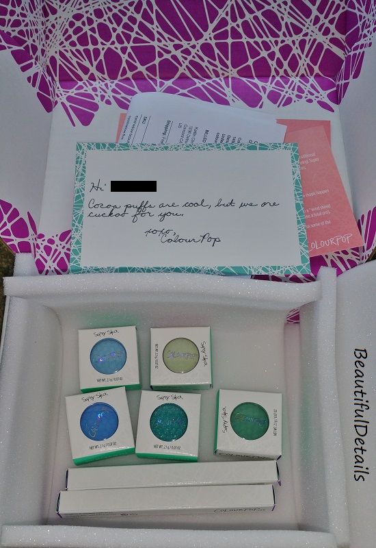
    My items arrived well padded and secured! They were well protected and to top it off the company hand writes a letter with your name on it! How cool and unique is that?!?! (Sorry, I scratched off my name there, but I don't feel like having my personal name out there like that.) Shipping is a low rate of $5, but spend $30 or more and they offer free shipping.

    I'll start the review with the Lippie Stix and Lippie Pencil that I purchased:
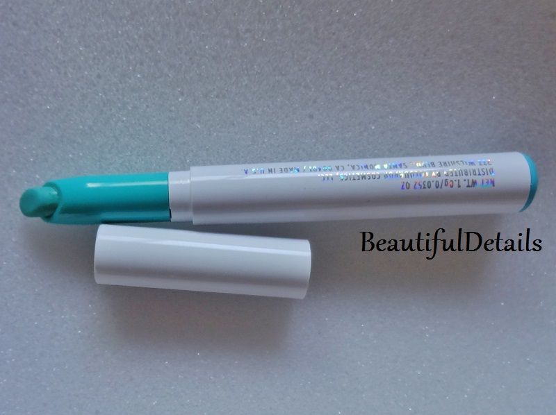
    I purchased the Lippie Stix in the color "Raw". 

    ColourPop describes Raw as follows: Raw is always better and this clean aqua blue shade with a satin finish is no different. SATIN FINISH Full coverage, long wearing lipstick glides on smoothly with a hydrating feel & has a modern satin finish.

    If you're unfamiliar with a "satin finish" in terms of lipstick, it usually means a demi-matte finish; so, it's not quite matte, but it's not going to be glossy or shiny either. It's that step right before "matte".
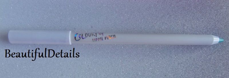
    I purchased the Lippie Pencil in the the matching color "Raw". The description of the color is the exact same as it's partner and promises that same "clean aqua blue".
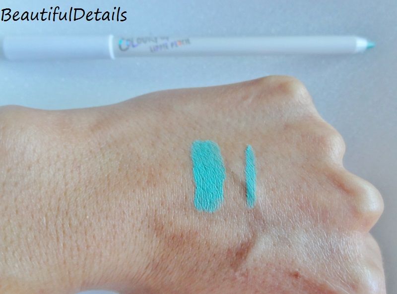
    Here are swatches of the lipstick and the pencil side by side in natural light. The larger swatch is the Lippie Stix and the thinner swatch is the pencil. I'm not sure how it will look on your screen, but on the website the color looked more on the blue-ish/turquoise side on the website. However, when I received it, it was definitely more "aqua" and green-ish. I do not see as much blue here as I was hoping for, but in all fairness the site did state it was aqua-colored.

    As for performance, I was slightly disappointed in the Raw lipstick. It is not as easy to work with as I thought it would be. It performs much more like a matte lipstick, because any dry patches on the lips will be highlighted and make the lipstick look rather messy. Also, dry lips in general make it quite hard to apply and have an opaque finish. So, obviously I suggest a good lip scrub before applying this and moisturize those lips! Winter is quickly coming and I can't see this lipstick being my friend during the cold season since my skin is always much dryer in the winter.

    The Raw pencil performed great! It was easy to apply and very opaque! It's a smooth application with no tugging and matches the lipstick perfectly. I'm normally not a fan of filling in the entire lip area with the pencil, but I feel it does help in this case since the Raw lippie stix can be hard to make smooth if lips are not in the right condition. Another good option to help is a lip primer.
    Next up are the Super Shock Shadows. Yes, a couple of these look smudged and that's because I couldn't resist trying them out as soon as I opened up the package! I promise they all arrived in perfect condition initially. I also have to add that not all of these colors are available to purchase. I had no idea that shortly after I bought these that they were going to do a final sale and then discontinue them. It kind of makes sense, because some of these colors were released for their spring collection this year and so they are probably just getting rid of them to make way for the winter and holiday collections, but I know it also can be disappointing to read a review and then not be able to purchase them. I apologize, but know that much of this review is to also inform the audience about the brand itself and the overall performance of the products.

    The Super Shock Shadows are unique. They are a wet powder shadow. It's not the typical dry powder or compressed pigment. The feel is similar to the Maybelline Bouncy Blushes and I would best describe it as a cream-to-powder finish. With that being said, it does take a few seconds for these to set and if you're not use to a product that is not dry it may take a little bit of getting use to and figuring out how to apply these.
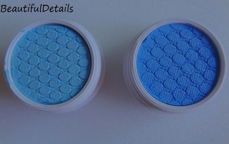
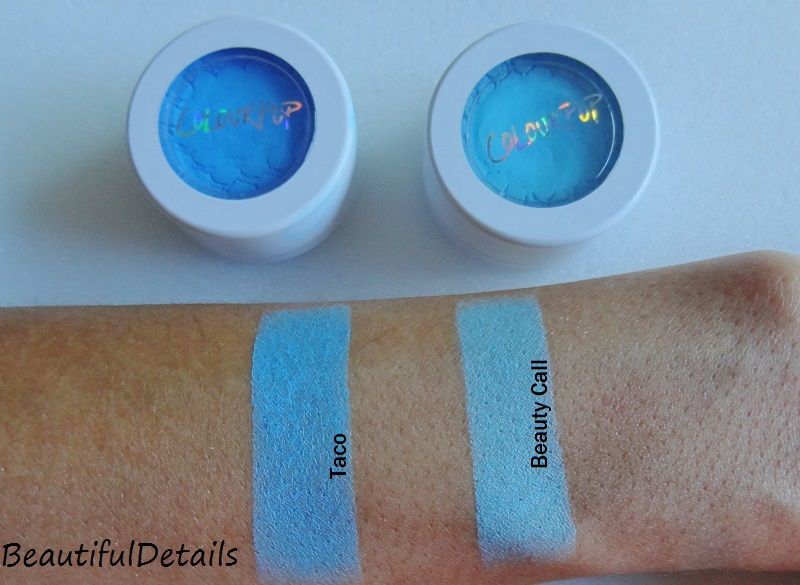
    First up, I'll start with the blue shades. Left to Right: "Beauty Call" and "Taco". As of right now, Beauty Call is no longer available for order anymore.

    Beauty Call is described as a "true powder blue with a matte finish". I would agree with Colourpop's description. Beauty Call was surprisingly thick and a little harder to apply then Taco. The issue with Beauty Call is that the formula is a bit thicker and takes longer to dry. Since it is a pastel shade, it takes a little bit of layering to get opaque for that true blue hue and so layering and dry time can take a bit. It's not an impossible shade to wear, but it does take some working with it to understand how to get it like the swatch appears.

    Taco is described as a "mid-tone aqua in a matte finish". I can't agree with that description. I do not see much aqua in Taco at all. To me this would be considered a dark turquoise at best and is more of a muted blue. The "matte" part is correct. Taco applies nicely and has beautiful coverage. The formula is lighter than Beauty Call and so it dries faster and applies smoother. It's a very nice and easy product to work with.
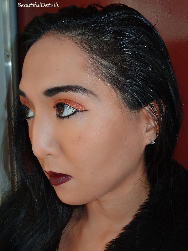
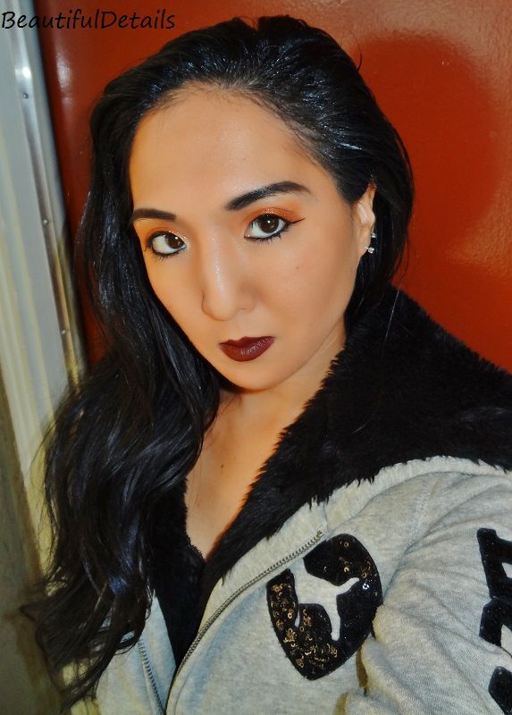
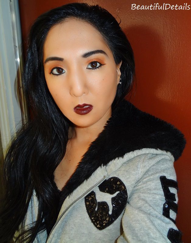
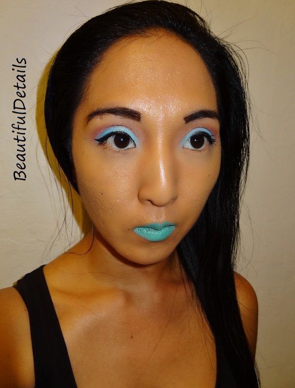
    In the picture above, I'm wearing the Raw lipstick and pencil. If you look closely towards the inside of my mouth you can see the dry patches and where the lipstick starts to separate. As the weather changes, my skin and body react pretty negatively, it's actually worse than in the winter. Changing of seasons is always rough for me. Anyway, the lipstick was not that well of a performer in the long run. I had about 2-4 hours with it before having to do touch-ups each time.

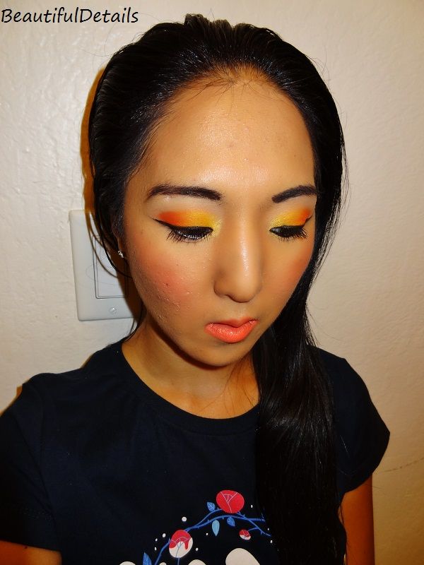
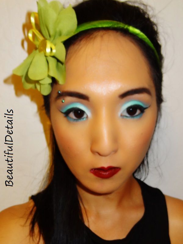
    On my eyes, I have Beauty Call on the inside of the eyes and Taco on the outside. Both are applied over a primer and I always use primer! Both wore well for me. I had them on for about 7 hours. 
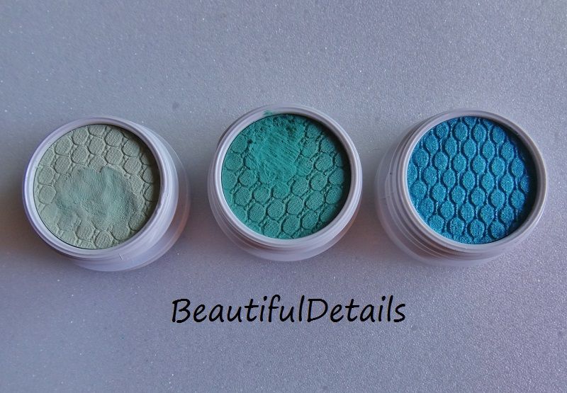
    Rounding out the haul is the greens! Left to Right: Flux, Snap Dragon, Ibiza. Again, the two shadows on the left are only smeared because I had to swatch and feel these babies right away! They arrived in perfect condition.
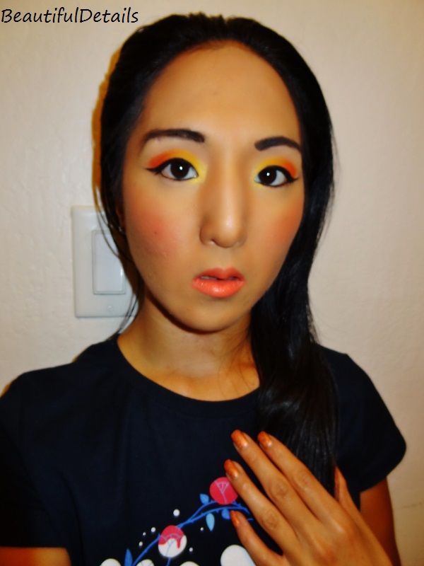
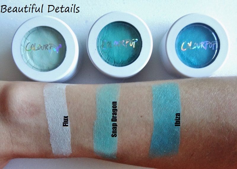
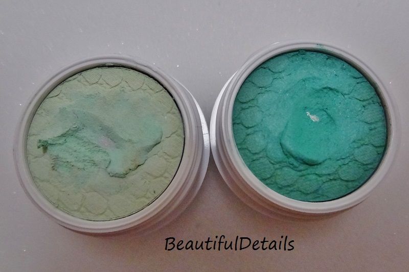
    Flux is described as a "light mint green with a matte finish" and I would say this is more of a hint of green then it is really a mint, or at least that is how it looks when applied. It is indeed matte. Flux will appear differently, depending on your skin tone. For me, it's almost white on my tan skin, but when I use it with other green shadows the green that Flux is shows up well. My only issue with Flux is the same issue I had with Beauty Call; it is a thicker formula than the rest and thus takes longer to dry and that only makes it harder to get the opacity of the color that most will desire.

    Snap Dragon is described as "mid-tone sea foam green with a matte finish" and I would say that is a pretty accurate description. Snap Dragon performed much like Taco did, as it was easy to apply and set much faster than Flux did.

    Ibiza is described as "bright turquoise with a silver and gold duo chrome finish". Ibiza is more of a bright teal in my opinion, but it definitely has silver and gold reflects that give it a shimmery finish. It is not easy to see the reflects and shimmer in my image, but it's there. This is not a matte shadow and ColourPop lists Ibiza as a "pearlized finish", which it is. I enjoyed Ibizia a lot. It is a pearlized finish, so to make it opaque it takes a few layers, but it's any easy shadow to work with and the color will look great on any skin tone. 
    In the picture above I have Flux on the inner part of my eye; Snap Dragon on the outer part of the eye; and Ibiza is on the lower lash line.

    Final Verdict
    ColourPop as a brand definitely won me over! Everything from the well secured packaging to the hand written note! It all really showed that they care about their products and they care about their customers! I really like the eyeshadows and I enjoy the formula. My only issues were with Beauty Call and Flux, which were the 2 lighter shades. They're not the easiest to work with and I would probably use a base under them next time. I would most likely not repurchase those either, however they're both part of the Spring 2015 collection and Beauty Call is already permanently sold out and Flux is being phased out. All the other shadows are great! The Lippie Pencil is a solid will win also, but the Lippie Stix in "Raw" is not the easiest formula to work with unless the lips are primed and ready.
    The only other topics I'll address is from the beginning of this post. As far as the complaints people launched about the shadows drying out and not receiving enough product, I'd have to say that is just people trying hard to find something to complain about. As you can see, in the picture above with Flux and Snap Dragon, I have technically hit pan on both. The issue here is that the shadows are creamy and they're moist, so they move and slide around a lot, so it's easy to look like the product is used more than it really is. It is true that you do not receive as much product as the jars may appear to hold and that is one thing that was a little surprising to me, but honestly for only $5 a jar you're still getting quite a bit of product. There's also the fact that most of us beauty consumers out there do not use up any one shadow in a week. The majority of us will still have that same shadow a year from now, so again it's not much to complain about at the price. The performance of these shadows is well over $5. As for the "drying" aspect, the ColourPop website does warn you to close the lids tight between uses, even if you're just switching between colors. I have had these shadows for a couple of weeks now and have not experienced any drying of the shadows, they still feel the same as when I opened them. So, I don't personally feel like these "issues" are a problem.

    Feel free to share your ColourPop experiences and favorite products from there in the comments below! Any questions or other comments can be left below as well!

    Tuesday, April 8, 2014

    Review: Wet N' Wild Limited Edition "The Style Award Goes To..."

    I'm reviewing the limited edition Wet N' Wild palettes from their "The Style Award Goes To..." collection for Spring 2014. These are just popping up in Rite Aids around my area, so if you feel like you missed out then try checking out your stores again. This collection came out about a month ago and it seems like Walgreens received these first and now they're popping up in CVS & Rite Aid. Last year, the Spring collection was released twice, again in the summer, because it was in such high demand. So, keep your eyes peeled in July or August if you missed out now.

    (Feel free to skip all the way to the bottom to read the Final Verdict and skip the details.)
    I purchased these palettes for $4.99 each at Walgreens and they only allowed me to buy 1 of each item from the collection, as they only had 1 display and it was in high demand. When I stopped at Rite Aid this week and saw the collection there, they had no problem with you buying multiples. I guess it just depends on location. - Personally, I love the packaging on these. The white "sparkles" (which really are just white printed images to look like glamour and sparkles) are a nice touch and I've never had a Wet N' Wild palette look this cute before.
    There were only 2 eyeshadow palettes released in this collection. On the right you have #34356 "Flirting at the After Party", which features multiple shades of purple. On the left you have #34355 "Walking the Red Carpet", which features neutrals and earth toned metallic colors. Each comes with double-ended brush that has a soft applicator and a bristle brush.
    Here are swatches of "Walking the Red Carpet". The top row is the left column. The bottom row is the right column. There are no names for these shadows, which is disappointing, but that's typical for Wet N' Wild. I was most excited about this palette when it came out, because of the metallic glitter-like shades, but this was actually a pretty disappointing pallet. Swatched, the shades do not look so bad. The brow bone colors and the eyelid color from the left column matches my skin tone almost exactly, and they're also not greatly pigmented. Most of this pallet is really powdery and makes a mess. The fallout of this powdery pallet makes for a challenge in applying the shadows as well. The gold color is very stiff and doesn't work for much more than a bright top layer over other shadows. The copper color isn't very bright either. Overall, I was highly disappointed in this pallet.
    Here is a look I created using MOST of the colors from the "Walking The Red Carpet" pallet. Overall, I don't feel these shadows performed that well. You get about 4 hours with primer before fading and in my opinion- you can get similar colors every day.
    Here are swatches from the "Flirting at the After Party" pallet. This pallet was pretty to look at when I first saw it and it definitely goes with the "Orchid" theme of 2014, but it didn't excite me too much before I opened it. I was more intrigued by the glitter and sparkle of Walking the Red Carpet, but after swatching and using the pallets I changed my mind. This pallet here is the winner and definitely worth the $4.99. The top row is the left column. The bottom row is the right column. Again, no names for the shades. The only real disappointments from this pallet are the "definer" shades -they're not as dark as most would like and they're a little powdery. These shades are soft, pigmented, blend well, and have decent staying power with primer. There is a bit of fallout, but nothing too bad. I was very impressed with this pallet.
    Here is a look I created using "Flirting at the After Party". I think it turned out quite well.

    Final Verdict
    Walking The Red Carpet - I give this pallet a 4/10. The packaging is about the nicest thing I can say about this pallet. The outside is cute, the shades are pretty to look at, but the performance is way below a normal Wet N' Wild pallet. The shades lack pigmentation and are messy. The powdery mess really makes it hard to apply the shades and they do not last throughout the day, even with primer. Unless you're a beginner or a just a collector, I cannot recommend this pallet. The only other reason one would want this pallet is 
    perhaps for experimenting or if one does not use these types of shades often.

    Flirting at the After Party - I give this pallet a 8/10. For the price, this is a good deal. Aside from the outside being cute, the pallet itself is pretty to look at and the performance of the eyeshadows is very good. With the exception of the definer shades being a little light and hard to work with and a couple of powdery shades, this pallet overall performs well. With primer, you will get a days wear out of it and experience just a little fading. I would recommend this pallet beyond collectors and beginners, because it works well.

    Wednesday, March 12, 2014

    Review: Pacifica Mystical Supernatural Eye Palette

    I'm reviewing the Pacifica "Mystical Supernatural" eye shadow palette today. I have had this for a while. I found it at Target on clearance. The price tag says it was originally $11.99 and I bought it for $8.38. I thought it was a good price and decent discount for me to try one of Pacifica's beauty products. I've always wanted to try them after trying some of their body creams (which I recommend), but all natural beauty products are a hit or miss and nobody wants to pay a medium sized amount of money for a miss. (Feel free to skip all the way to end to read the Final Verdict and skip the details.)
    The box was pretty, but once you take the palette out of the box it's a little less eye catching. Some might prefer the simple look of the palette design, but I feel if you're going to have an extravagant box and you're going to name your palette "Mystical Supernatural" then you need an equally exotic palette case to match. Anyway, the palette is just a magnetic closure and is made of cardboard. The cardboard is more durable than a shoe box, but it's a little questionable how it would hold up if you are an intense traveler. We all know the wear that items receive when you travel or take things on the go with you a lot and I'm just not sure this one would hold up so well. I will say, that for an all natural company it does not surprise me that it would be in a recycled form of packaging. Another thing to note- the clear part over the shadows is just clear plastic and it's kind of on the flimsy side; I would find this really easy to puncture.
    Well, the packaging is not the most important part. It's the performance of the product that matters most and here are the swatches! The shadows do not have names and while I prefer that shadows in palettes be given names (if they don't already have them), what can you do? I tried my best to line the swatches up with the shadows.

    From left to right:
    • The 1st shadow is a light pink iridescent. In the picture it looks beige or a light skin tone color, but in real life it is pink and in the light you will definitely see the iridescence. 
    • The 2nd shadow is a pale coppery gold. It is sheer and has a nice shimmer to it.
    • The 3rd shadow is a taupe color. This is a very sheer color and once applied appears as an iridescent. It takes quite a bit of layers to get the actual color you see out of it.
    • The 4th color is a purplish blue. It looks more navy in the picture than it appears in real life. This has quite a bit of shimmer to it and is the boldest of the 4 colors.
    Here is a look I created using all 4 colors.
    • I used the Taupe color all over the lid.
    • I took the Navy color and put it in the outer v and crease and then blended, which I feel really helped bring out the Taupe color.
    • I used the Gold color for the brow bone & highlight, as well as the highlight underneath my eye. I feel this color went pretty well with my skin tone.
    • Finally, I used the Pink color in the inner corner of the eye to brighten and extended it a little underneath the eye.
    Final Verdict: I give this palette a 6/10. This palette is great if you're looking for a sheer wash of color or a very natural look, but none of the colors are really high in pigmentation or boldness. The shadows are super soft, apply easily, and blend easily. Without a primer, these shadows do not look as good, nor do they last that well with oily skin. When I used these without a primer I would say I had about 4-5 hours of decent wear, but then it started to fade and by the end of the day the oil from my skin pretty much dissolved it away. With primer, I had much better results and you can get a good day out of it. I think this palette would actually work better in-conjunction with other shadows/palettes than by itself. The the only other reason I give this a little bit of a lower rating, is because of the packaging. Like I said earlier, I think it'd be easy to puncture and damage the case and thus in the end damaging your shadows. - If you're looking for something with natural ingredients, sheer washes of color, and a natural eye look then you'll like this palette.

    This palette is available at the Pacifica website for $14.99 and available at some Targets and on the Target website for $11.99.

    Sunday, September 15, 2013

    Swatched: Wet 'N Wild Fergie Fall 2013 Collection Part 1

    First off, let me start by saying that I know it's been 2 weeks since I've posted anything, but I moved. It was not a small move either; I moved to the other side of the country. I drove too, which meant that it took days to get there and I had an unexpected car problem along the way which delayed me a day. Not to mention that I arrived to my new home one evening and the next morning I started work, and I have been working all week long. The day of my last post, I actually was leaving within less than 48 hours for my trip and still had to finish my work (job there), packing, loading up, and saying goodbye. - I am doing well though and am trying my best to adjust to a completely different atmosphere and culture, as well as dealing with being away from my family, friends, and cat.

    NOW! As promised: Swatches of the Fergie Fall 2013 limited edition collection from the makers of Wet 'N Wild! Along with a review! I realize this is kind of late, but this collection for some areas is just hitting the market and for everyone else who has been on the fence about buying it, this may help you. - I'm starting with the Photo Op Eyeshadow Palettes to get them out of the way. I know that the majority of people do not seem to like these, but I have had good luck with the core line. I will say that with the few limited edition palettes I have used full out, they are not as good as the core line ones for some reason, with the reason being unknown to me. Overall, for the value, I think they're good and you're getting a deal. So, I like these palettes. These palettes seem to be a "love/hate relationship" for people; either people really enjoy them or they loathe them. So, feel free to skip this entry if you're not into them, or keep reading if you want see.
    There are 4 palettes in this limited collection and you can easily identify them with the "limited edition" stickers that were stuck on them. Starting with the top left- The pink & purple palette is called "Rose Parade"; the gray, smokey palette is "Bulletproof Glide"; the blue palette is "After Hours", and the green palette is "Suburban Jungle".
    Starting with "Rose Parade", this palette surprised me the most. I'm not a huge purple or pink fan when it comes to eyeshadow; I just don't wear them a lot or find myself reaching for those colors that often, especially purple. I do, however, like this palette! 
    Here are swatches of the 5 colors from Rose Parade with no primer and a few swipes of each color. In my opinion, these swiped nicely with good pigmentation and I didn't have a big issue with fallout; there was a little fallout with the bright purple, but nothing major and not enough to complain about. The colors are real smooth and easy to apply. The light purple and the light pink are stiffer than the rest of the colors, but still very workable.
    I did my best to try to show the gold in the dark purple color. The color has gold shimmer in it and though it appears to just be a grayish purple, it really is an awesome color! The purple in the center and the black are matte, but the rest have a shimmer or glitter in them. I'd also like to add that this palette goes nicely with the limited edition creme eyeliners and that came out with this collection, especially the purple one.
    Moving on, the "Bulletproof Glide" palette is the most disappointing of the 4. The collection looks good on the palette, but the colors are not that great in performance and are not anything special. With all of the nude palettes out, both drug store and high end, I feel like you can't really produce a palette like this without making it great. 
    Without primer, I swatched the colors with just a swipe. The colors do not have great pigmentation, with an exception of the black in the center of the palette. I know that the colors kind of blend into my skin tone, but trust me when I say the pigmentation is not really there in this palette.
    Here they are with a couple more swipes. The colors are buildable, but not near as good as "Rose Parade" and it takes some work. The black and the brown color are matte, with the rest of the colors having shimmer to them. The black is really the only good performing color in the palette. The brown color does perform well and has good pigmentation, but it just does not go well with most skin tones since it has a grey tone to it. The creme color is just okay, but takes a wild to build and the gray and silver colors come up pretty disappointing. I would recommend skipping this palette, especially if you didn't want to buy them all anyway. I definitely would not use without a primer. I don't mean to sound hateful towards this palette, but in comparison to the others it is pretty bad. Also, if you buy the "Rose Parade" palette you're going to get a matte black. If you buy the "After Hours" palette, you'll get a silver which is pretty much the same one that you see here. So, not a loss if you skip this one.
    Next up: The "After Hours" palette. This palette was made to go with the "Cobalt Vault" eyeliner that was created in this collection. -Just look at it! It definitely is a nice palette to create a night-time look.
    The swatches are without a primer and with a couple swipes. The colors are decently buildable. This palette does have a pretty big fallout problem. The bright blue, lilac, and medium blue are quite big in terms of fallout. The colors look nice and can be built up, but you'll want to be careful with applying. The darkest blue, which comes off being black (even in person), and the silver are not too bad with fallout. The lilac and the bright blue are matte, with the rest of them being shimmery. The silver color in this palette comes off much better than the silver in "Bulletproof Glide" and it looks more like it has glitter pieces in it. - I like this palette, but I don't love it. If you don't normally wear colors like this, you may want to pick this up, since it's a good value and you'd have a chance to play around with this palette. For the most part, it's nothing compared to MAC or higher end brands, but it's pretty nice for a drugstore palette. It's not a must have in my opinion though.
    Finishing this collection with "Suburban Jungle". This was the palette I was most excited to get my hands on! These are my colors, right here! A lot of people compared this palette to the "Shades of the Hamptons" palette that was released in the limited edition summer collection this year, but personally I think this one stands on its own. With the exception of the gold color in the center, it really is not that comparable. Shades of the Hamptons has a bluer, more turquoise color in it, where as this is an aqua green. The purple color here is just purple and SOTH has a very light pink. There is a blue in SOTH, which you do not get here, and the green in SOTH is more of a true green and much brighter.The gold color is slightly different in the 2, but not that much; in SOTH the gold is a bit more shimmery and pigmentated.
    Again, no primer was used and it has a couple of swipes. The colors build decently. I like the palette and "Rose Parade", and they would be the 2 must-haves for me in this collection, both due to their performance and colors. Sadly, the bright green is the worst performing color in the whole palette and the one color that I really looked forward too. It has a bit of a fallout problem too. The rest of the colors are nice. The only other thing I would say is that the gold here would be better if it were not so light. 

    This concludes my review and swatches for this collection. Hope this helped anyone who was on the fence about any of these. This collection is not as good as the summer one, in my opinion, because I feel that only 2 of the 4 really are worthy of attention.