[Kat Von D - Mi Vida Loca Palette]
I recently was gifted the Kat Von D "Mi Vida Loca" palette! I have been waiting, wanting, and hoping to get this palette since the previews released this summer! I suppose I should be thankful for an early release and that I didn't have to wait for it any longer, but it still feels a bit early to consider this a holiday palette. -With that being said, let's take a look at this palette! I haven't actually tested out the shadows by wearing them, so all my reviews of the colors are simply from the swatches.
For an overall review and to skip the fine detail, scroll all the way to the bottom of this post!
For an overall review and to skip the fine detail, scroll all the way to the bottom of this post!
Info: Mi Vida Loca is only available at Sephora, as Kat Von D beauty is exclusive to Sephora and limited edition. It is $59 US and is said to be valued at $210. As of right now the palette is still available on the site and in stores. However, the website did sell out of it's initial stock and has since been restocked. No telling if they'll receive anymore once it sells out again. Many stores still have them, but stores often do not get restocked on limited edition items.
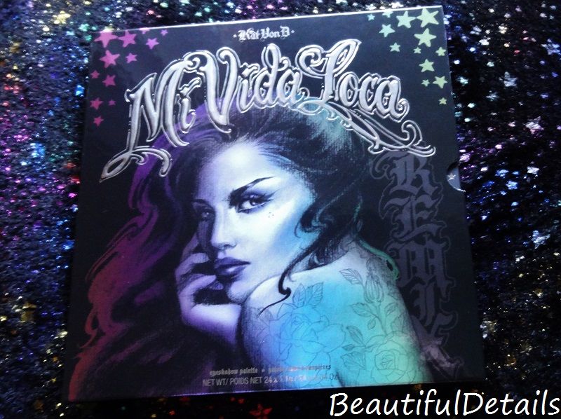
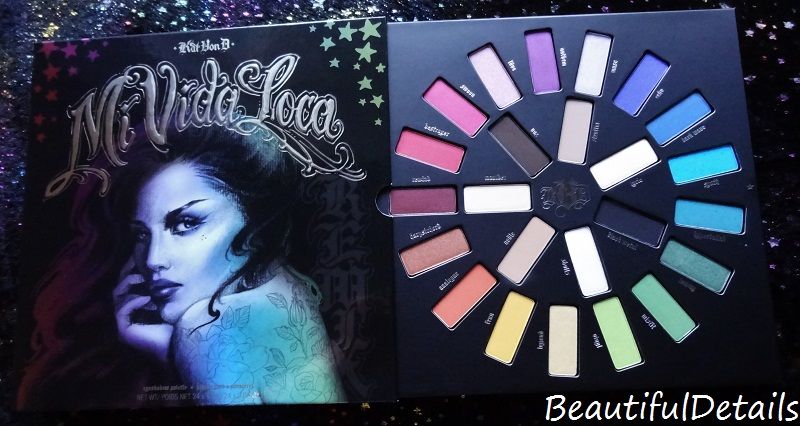
The palette came in a sturdy plastic cover. It was not anything fancy, so need to show this; it was clear and plastic........ The palette slides out of the cover like a record and reveals a wheel of colors. Aside from this palette being released way before the holidays, it doesn't give a very holiday feel and perhaps that's just another reason why it might as well have an early release. The palette is entitled, "Mi Vida Loca", which is Spanish for "My Crazy Life" and the colors remind me of the MAC counter with all the bright colors and hues -not that it's a bad thing though. It all around screams the colorful vibrations of the Hispanic culture in Kat Von D's edgy style. Like I said before, the palette slides out like a vinyl record and it's almost as big as one! The palette itself is quite large and this will a problem for those who want to travel with it. Not only is it not travel friendly, but I have read other reviews in which people say it is extremely hard to depot these shadows and it takes a lot of effort to do so. The packaging is still beautiful and eye catching though and deserves an A+ for that. It's been a while since I have bought or just simply saw a palette that had packaging this artistic. It probably helps that Kat Von D is an artist.
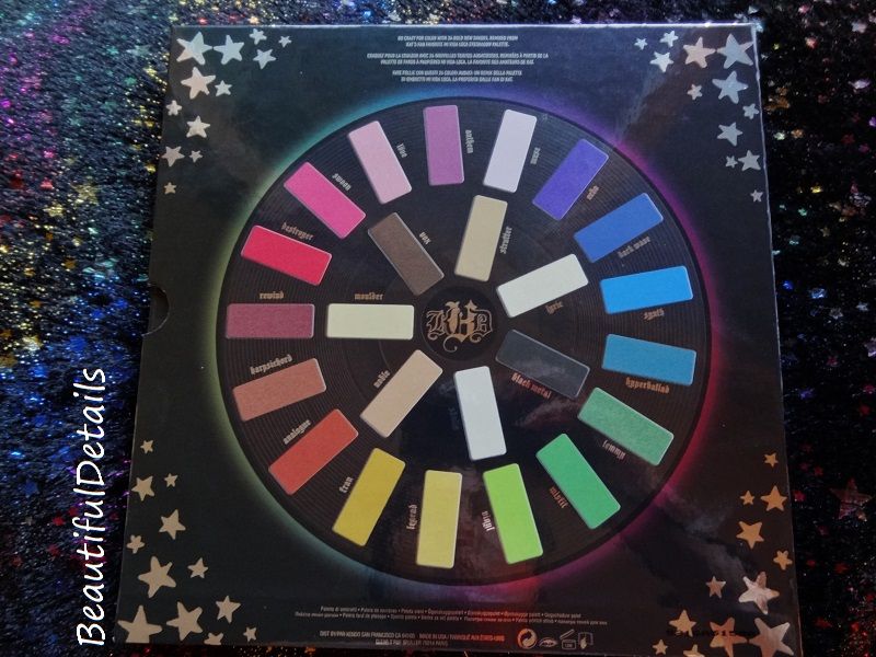
[the back of the Mi Vida Loca palette]
Even the back of the palette follows the theme and is beautiful! It's obvious that Kat Von D really put a lot of thought into every detail of this palette!
The palette was released on October-3 and I immediately wanted to buy it. However, I have never owned a Kat Von D eyeshadow or eye palette in my life and I decided to wait for more reviews. My personal feelings would be that Kat Von D's cosmetic line has a group of followers and they're die hard for the products, but sometimes fanaticism can be blinding. The reviews I read were mostly favorable, but I saw a lot of complaints about the colors not being as vibrant as they appear on the palette and the performance not living up to the hype. Of course, there was also the unfriendly travel complaint too. However, as I said at the beginning of all of this, I was gifted this palette! So, now all that is left is for me to share my views and opinions!
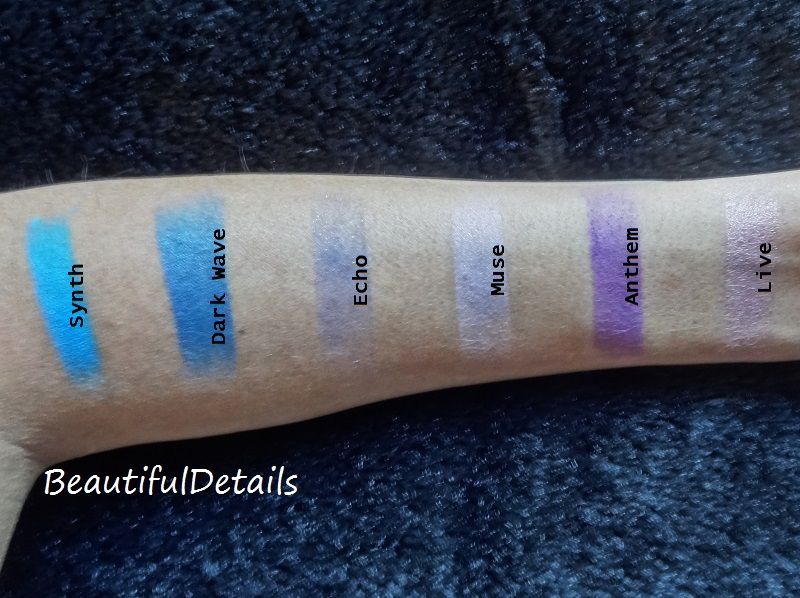
Moving onto the swatches! Keep in mind: All swatches are without a primer! Although I do always use a primer on my eyes with my eyeshadow, I wanted to see how well these shadows did on their own after reading the complaints. Also, remember that I have not tested these on my eyelids yet! That will come later. All swatches are in natural light. I have medium skin color and it's a bit tan from the California sun.
[Left to Right: Synth, Dark Wave, Echo, Muse, Anthem, Live]
- Synth - It's a bright turquoise matte blue. It's swatched 2x's on my arm. I experienced a lot of fallout with Synth, but it is pigmented and that's a big plus! When I originally saw the palette my eye went straight to this color and I'm glad to see that it's pigmentation seems to hold up to the vibrancy on the palette.
- Dark Wave - This is a dark jean blue satin. It's swatched 3x's on my arm. It does not have the best pigmentation, but it is buildable. I imagine this would best be used in conjunction with other colors, particularly darker colors that could help deepen its depth. I did have a little fallout with this one too.
- Echo - This shadow is barely visible on my arm, but it is there! Because of the natural light it is hard see the sparkle too, but there's plenty of it. This is swatched 3x's and it is a dark purple with pink and blue glitter in it. The glitter is quite chunky for a shadow. It is very sheer, as it barely shows up on my arm, but I experienced no fallout and that's a plus for a glittery shadow! I feel this shadow would best be used as an glittery topper to an eye look or just to add some deep sparkle. It's obviously not a shadow to be used on it's own.
- Muse - This is a matte muted lilac and swatched 2x's. There was very little fallout with it and it is sheer. I feel this color would best be used as a highlight color or to brighten other colors.
- Anthem - This is an orchid purple and it's swatched x3's. It's chalky and there was a lot of fallout. It's also quite sheer. This is definitely a disappointing shadow from my testing experience. My advice would be to use it as a base color for other shadows or for a sheer wash of color.
- Live - This is a shimmery reddish pastel pink. I swatched it 2x's. There was very little fallout. I was quite pleased with this shadow and it applied nicely.
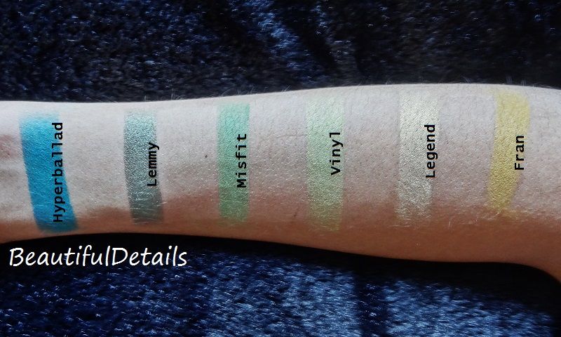
[Left to Right: Hyperballad, Lemmy, Misfit, Vinyl, Legend, Fran]
- Hyperballad - This is a darkened teal matte. It's swatched 2x's on my arm. I found this shade to be very pigmented and only a tiny bit of fallout. I feel like this will perform very well on the eyes.
- Lemmy - This shade really surprised me. On the palette is appears to be a shimmery green that leans towards the mossy side, but once swatched it is more of a olive green with blue undertones and a lot of shimmer! It's not sparkly, but there is a lot of shimmer to it. I only had to swatch it 2x's and I had no fallout. It is very pigmented. It feels very nice and was easy to swatch with a smooth performance.
- Misfit - A grassy green that's matte and swatched 2x's on my arm. It is actually quite pigmented and very buildable. I had only a little fallout. This shade really shut down the complaints that I saw about the colors being chalky and unusable, because Misfit is a matte that is a bit stiff, but the color and performance are there!
- Vinyl - A neon green satin. I swatched it 3x's. It's sheer, but I had no fallout and it is buildable. I feel this shade would do well over other shadows that could help empower it or as a highlight color.
- Legend - A buttery yellow shimmer. I swatched it 2x's. It's sheer, but buildable. I hardly noticed the fallout. I don't personally feel this is a disappointing color though. It would work great as a highlight color or over other colors to brighten them up and/or add shimmer.
- Fran - This is an orange-ish yellow that reminds me of pollen. I swatched it 3x's here. There was fallout with this shadow and at first it was very patchy. It is buildable and does smooth itself out. With a primer or something to help it adhere, I feel this color could be successful.
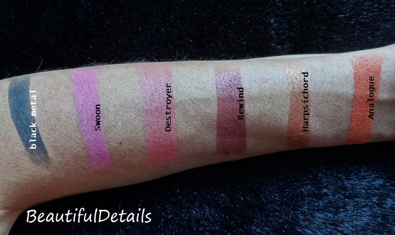
[Left to Right: Black Metal, Swoon, Destroyer, Rewind, Harpsichord, Analogue]
- Black Metal - What you see is what you get with this shade; it is a matte black. I swatched it 3x's. There's fallout and this shadow is chalky. It is a bit sheer, but was buildable. I feel this shadow would be great for a smokey eye, rather than an all over the lid shade. I feel it would take a bit to get this shadow opaque over the entire lid.
- Swoon - A reddish pink satin color. Swatched 3x's on my arm . It's a buildable color, but a little patchy and a little chalky. Not the best performing shade in the palette. I would definitely recommend using this with other shadows and primer.
- Destroyer - A red satin. I had to swatch this 4x's! There was fallout and it was a bit chalky. It's sheer, but buildable. This is another shade that I feel is meant to be used in conjunction with other shadows. It would help out other shadows and be a good overlay, but I can't see using this alone.
- Rewind - This is a reddish burgundy shimmer. Swatched 3x's here. There was fallout and it was patchy, but it is buildable and smooths itself out.
- Harpsichord - This is an orange copper shimmer. I only had to swatch it 2x's and there was no fallout! It is very smooth and silky! I can't wait to work more with this color!
- Analogue - This is an orange satin with pink undertones. The pigmentation in this shadow is good and I only swatched it 2x's. However, there was a lot of fallout and it was a little chalky.
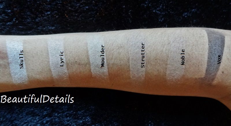
[Left to Right: Skulls, Lyric, Moulder, Strutter, Noble, Vox]
The last 6 swatches are the neutrals from the inner part of the palette. Neutrals are always the trickiest shades, because they usually appear vastly different on each skin tone. A reminder- my skin is a medium tone and is tanned from the sun.
- Skulls - This is a pinkish cream color with a shimmery finish. I swatched it 3x's. The shimmer is very noticeable and it's a buildable color. I had no fallout with this shade. I feel this will perform well on the eyes and work great as a highlight color.
- Lyric - A peach cream color with a shimmery finish. I swatched this 2x's. There was very little fallout, but it's a bit sheer. I feel this color was meant to be made sheer though. It will blend will with light to medium skin tones, so it'll work well to brighten up the eye area.
- Moulder - This is a light tan matte shade that looks a lot lighter on my tan skin than it will for those who have fairer skin. I swatched this 3x's. It's a bit powdery, but only had a tiny bit of fallout. It is a little chalky too, but not unworkable.
- Strutter - This is a light cafe brown satin. It almost blends into my natural skin, or the untanned part of my skin. So for me, this will be a good blending color. I swatched it x2's. There was fallout and it's chalky, but still usable.
- Noble - A light peach colored brown with a satin finish. This is another shade that blends pretty well into my natural skin tone. There is not too much difference between this shade and Strutter, so it almost seems redundant in the the palette. I swatched it 3x's. There was fallout and it's a little chalky, but it's a buildable color.
- Vox - A deep brown shade with a matte finish. I had to swatch this 4x's, as it was a sheer color for a shade that looks pigmented on the palette. It is buildable, but there was fallout. This shade performed similar to Black Metal and will probably work great for a smokey eye, but would take a lot of work to get a solid brown lid; both look very pigmented at first sight, but perform more sheer.
Final Verdict
This is a nice palette. It's not the most solid performing palette out there, but it's far from the worst. There's a nice mix of brights, neutrals, and dark shades. It is also a good mix of mattes, satins, and shimmers. I feel this palette would be great for those who want to use unique colors once in a while, but do not want to pay for them individually since that would be expensive and of course there would be the neutrals that one could use all the time. There is fallout with most colors and a little more then I would like. The shadows are not stiff, but some of them are chalky. The shimmer shadows seem to be the best performing shades and while there are a few disappointments, the pigmented colors do seem to live up to their hype with the exception of the neutral dark colors. The palette is not travel friendly and the shadows will be a challenge to depot, but it is beautiful and the details of the packaging are definitely eye catching! If you're a Kat Von D beauty fan or a make-up collector, this is a must! If you're not a fan of bright colors or shimmers, save your money, because you can purchase neutral palettes or lighter colors without having to spend $59 on a palette full of other colors you'll never touch. I would not recommend this palette to a beginner or someone who does not have a lot of experience with different types of eyeshadow formulas. Remember that not every eyeshadow made in the world is meant to be an opaque solid color and that's why I feel people need to give these shadows in this palette a break. However, there are a few shadows in this palette that will require work and the knowledge on how to get them to perform well.
Personal eye looks coming soon! Let me know if you bought this palette and what your thoughts! Or tell me what you think from the review if you're not bought it! I would also love to read others reviews, so please leave your link below!
No comments:
Post a Comment